Friday, June 11, 2010

Year Video


This is some of my graphic design year condensed into this little video- the song is for Frankie Phares.

She's still OUR idol...


This was a VERY badly made poster I had to make one day for graphic design class as Siobhan Magnus is a former student at my school and my graphic design teacher was her drama teacher... well too bad she didn't win...

Wednesday, May 26, 2010

Shoe Shop Now Open

This was a sign we had to make for class. I started with something different but I couldn't get the design to come out the way I wanted in photoshop so I made this one instead.

Monday, May 24, 2010

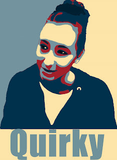
Posterized Poster- OBAMAFY ME PLEASE ;)
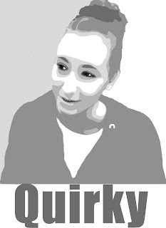
This was the first black and version of my own picture in the Obama "Hope" version. The lines aren't very smooth, but it gets better in the next version.
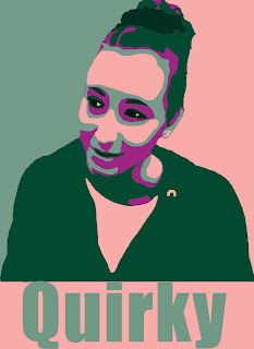


This was my next version of the Obama "Hope" poster. In this one the lines are much more smooth and I took the time to zoom in far more and get rid of/smooth out any stray lines. The colours are okay, not my favorite, but I wanted ones that worked well together; these colours worked well together so I used them.


This is the final version of my Obama "Hope" poster in the original colours the original artist used. I like this version best because I think the colours work very well together. Besides the colours nothing was really changed from the previous version. "Hope" you like it.

Monday, April 5, 2010

More numbers in dots

This is the rest of my numbers from the numbers in dots "collection". 10 through 25, pretty much self explanatory after that.

Wednesday, March 31, 2010

Drawing

This was a drawing I made in my spare time and scanned onto a computer in graphic design. This was my first "real" drawing that actually had skill and I like it. 

Numbers in Dots

This is numbers in the same style I made the alphabet, 4x4 light dots with darker ones behind those. Only took about 5 minutes and was really easy. 

Alphabet in Dots

This was my original alphabet that I made using a background of 4x4 light dots and putting darker coloured dots on a layer behind those. It took a while to get going but once I got the hang of it it was really simple. 

C.R.A.S.H. News page three

This was the last page of my C.R.A.S.H. News magazine. The last picture is also the cover picture and the stories are still crazy. 

C.R.A.S.H. News page two

This was the second page for my C.R.A.S.H. News magazine. Pretty much the same style as the first only different stories. 

C.R.A.S.H. News page one

This was my first inside page of my C.R.A.S.H. News magazine. The stories just came from the top of my head so, no, I am not crazy no matter how much I may seem it. 

C.R.A.S.H. News cover

This was my cover for our "World Weekly News" project. We had to create a fictional magazine with six fictional stories, and I must say mine are really outlandish. The picture is from the last story about Michael Phelps. 

Tuesday, January 19, 2010

Midterm

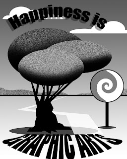
This was part of my class' midterm. We were given a printout that had this picture on it and we had to recreate it as best as possible. It was hard to get started and getting everything in the right place was a bit tricky, I had to redo the tree trunk three times, but I like the way it came out. Fingers crossed Mr. Sullivan does too!

I know I have some things not on here that the rest of my class does but sadly my computer obviously hates pumpkins and hand crafted magazines. The only part of the pumpkin I can get on here is a little slice, it likes to save it in pieces, and my original magazine just refuses to show its face, it's a little computer shy. 

Wednesday, January 13, 2010


For this project we had free create license. We had to create an imaginary restaurant and a menu to go with it. We had to have drinks, appetizers, entrees, desserts, and sides, along with prices. I liked this assignment, although it was hard to get going. 

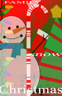
This was my first attempt to make my holiday poster. We had to create six images using only basic shapes and when put together all of the images had to have opacities lower than 100%. 

This project left more up to us than I think any other before it had. We could see the steps as they were printed out and hanging in the room, but each witch's face had the ability to be completely different than any other one. 

For this project we had to place our face onto the body of a person on a magazine, I chose to do so with Taylor Momsen on the cover of TeenVogue.
This was a project we had to make that was one of the first ones we did. The colours and shapes were given but we arranged them and the words were of our own choosing. 

This was a poster we had to make for the open house at our school. The layout was given to us but we chose the colours and the texts. 
This was another one of the contour continuation quizzes. We had to use the same shapes and colours as last time but arranged differently and on a different background. 

For this project we had to use certain and specific shapes and arrange them in any way we like, but it must use contour continuation. I came up with this. 

For this project we had to create a page of gumballs, all of them just different colourizations of the original gumball. It was tedious and kind of annoying but I like the way it turned out. 

For this project we had to create a black cat for Halloween, but we could only use the four shapes that you see at the top of the picture. It might not be my best but I still like it. 

For this project we had to have sixty things we like spilling out of our head. These are just some of the things I like and I like the way it turned out :).